Consistent use of color is essential to maintaining the unique OneRoom Health look and feel.
Our color palette reflects clarity, confidence, and innovation. It is designed for digital and print flexibility while maintaining accessibility standards.
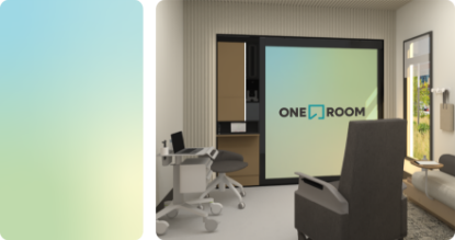
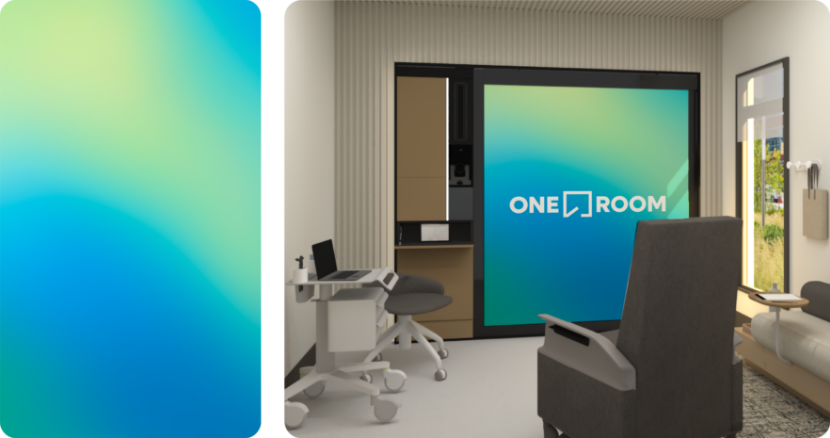
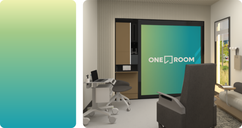
The OneRoom brand uses gradients as backgrounds, visual accents and to highlight key words. Below are guidelines for gradient use cases and best practices.
Gradient one
Light colored freeform gradient
Gradient two
Dark colored freeform gradient
Gradient three
Linear gradient
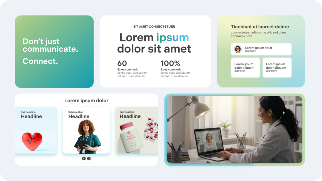
Gradient four
Linear gradient used for text
Gradient treatment samples
Best practices
The integrity of the gradients must be kept at all times. Altering the gradients by ways of color swapping or adjusting the color percentage is not accepted.
Do not alter the colors.
The pale yellow should not be a prominent color.
To ensure accessibility, do not alter
OneRoom text gradients on white.