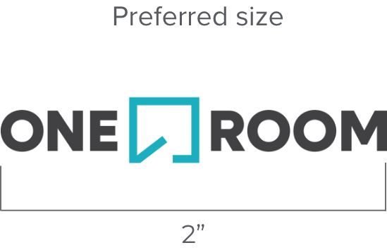
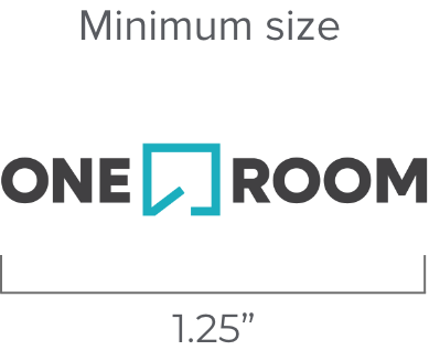
Size
Whenever possible, the logo should be used at a size between 1.25” and 2” on printed materials. The logo is measured from the left edge of the wordmark to the right edge of the “e.”
Clear space and sizing
Maintain a minimum clear space around the logo equal to the height of the ‘O’ in OneRoom. The logo should never appear smaller than 1 inch in print or 72 pixels wide on screen.
For the mark, the minimum clear space allowance should be equal to 3/4 of the mark itself. Repeat the scale of the mark around it, regardless of the scale per circumstance.
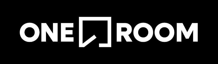
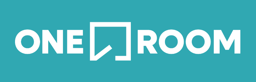
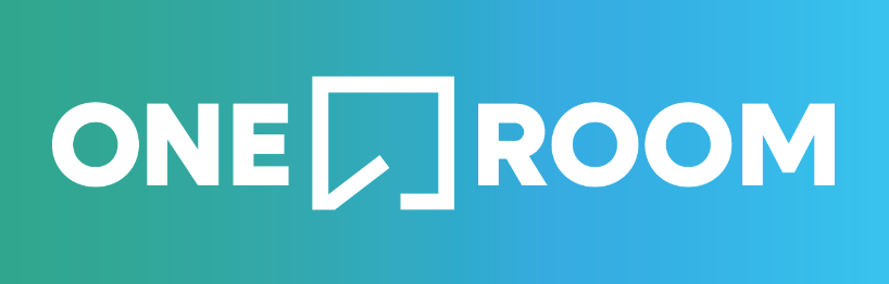
One-color solid logos
The one-color solid black or white (sometimes called reversed) logos are intended for use when reproduction methods prohibit the use of the full-color logo. However, a one-color logo may be ideal if the logo appears in a busy environment, such as over an image.
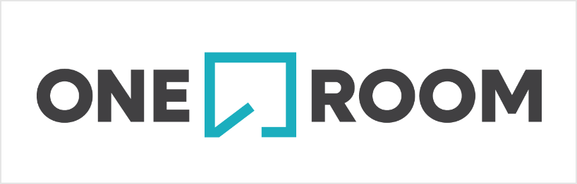
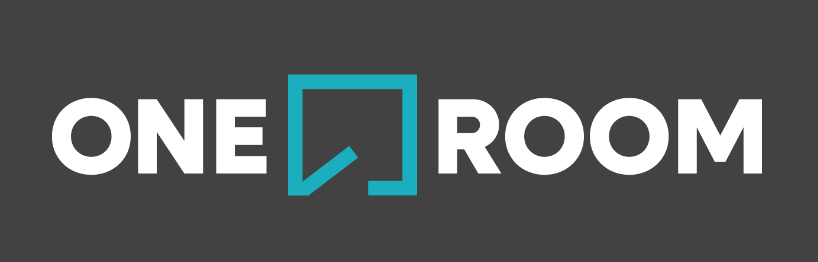
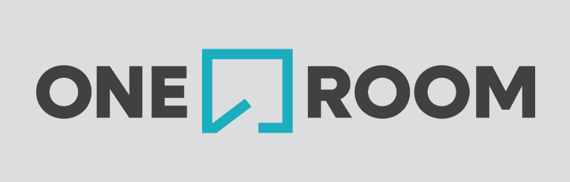
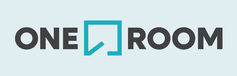
Backgrounds
The full-color logo should be used against solid white or light gray to ensure maximum contrast. If the logo is used on a heavy color or darker gray, the no-color version of the logo should be used unless sufficient contrast allows for a partial knockout, as shown below. In the event where the logo is used on an image, special attention needs to be put toward sufficient contrast.
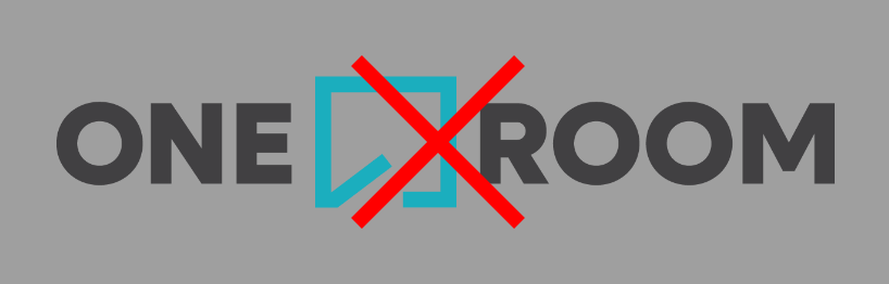
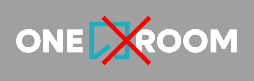
Incorrect usage
Proportions
The integrity of the logo must be kept at all times. Altering the logo by ways of stretching, compressing, shearing or color swapping is not accepted.
Co-branding and partner lockups
When used alongside partner logos, maintain balance and equal visual weight. Use approved co-branded lockups when applicable.
Please reference our Governance and Contact for more information